library(ggplot2) #Loading ggplot2 package
data("iris") #Loading the built-in mtcars data set

ggplot(data = iris, mapping = aes(x = Species, y = Petal.Width)) +
  geom_bar(stat = "summary", fun = "mean")
While it is straightforward to make a graph using ggplot2 in R, it can be difficult to make it look exactly how you want it to. A lot of the default settings do make a good graph, but there are a few common tweaks that are an easy way to bring your plots to a whole new level.
Labels are the text that define all of the different parts of our graphs. While R is good about automatically choosing many of the labels based on our data sets, a lot of the time you may want to change them to make them more descriptive or remove extraneous ones.
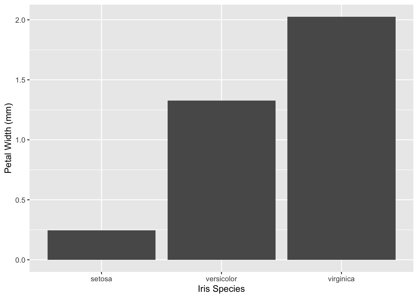
Using our iris plot as an example, we see that ggplot2 will default to using column headers as labels.
library(ggplot2) #Loading ggplot2 package
data("iris") #Loading the built-in mtcars data set
ggplot(data = iris, mapping = aes(x = Species, y = Petal.Width)) +
geom_bar(stat = "summary", fun = "mean")
However, often these headers use unusual punctuation or shortenings that are confusing to people who are viewing the graph. Here is how we change that:
ggplot(data = iris, mapping = aes(x = Species, y = Petal.Width)) +
  geom_bar(stat = "summary", fun = "mean") +
  labs(x = "Iris Species", y = "Petal Width (mm)")
Using the labs() function, you can set the text label for any of the mappings you set in the aes() function.
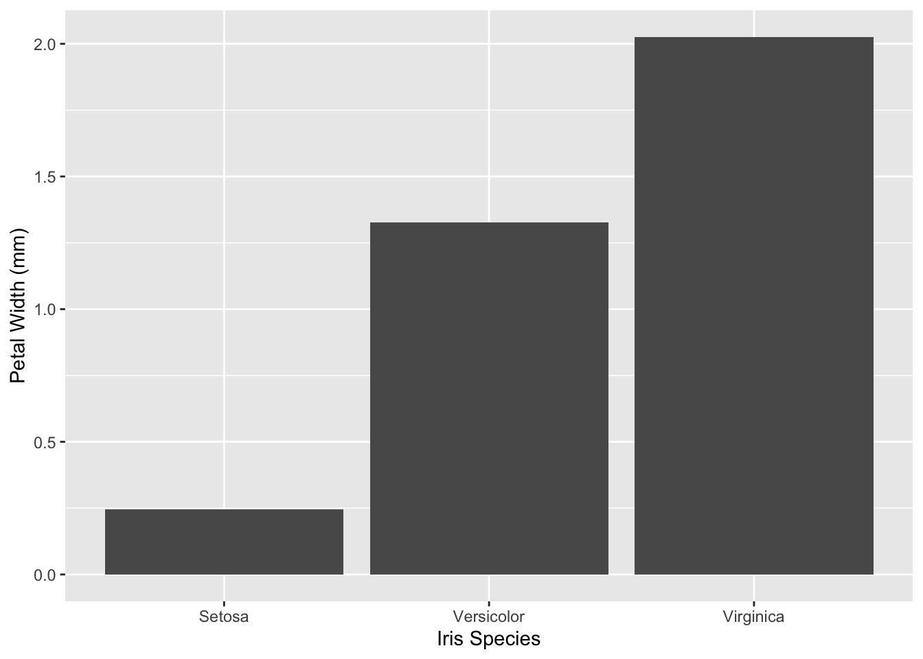
You may also want to change the text labels for each iris species. Those labels are axis break labels, as each tick is break on the axis. As there are two main types of axes, each axis has two main functions to set the break labels.
An axis is considered discrete when each variable on the axis is its own group. For example, each break represents one species, such as the iris graph above. These are most commonly the x axis or the color/fill grouping.
ggplot(data = iris, mapping = aes(x = Species, y = Petal.Width)) +
  geom_bar(stat = "summary", fun = "mean") +
  labs(x = "Iris Species", y = "Petal Width (mm)") +
  scale_x_discrete(labels = c("Setosa", "Versicolor", "Virginica"))
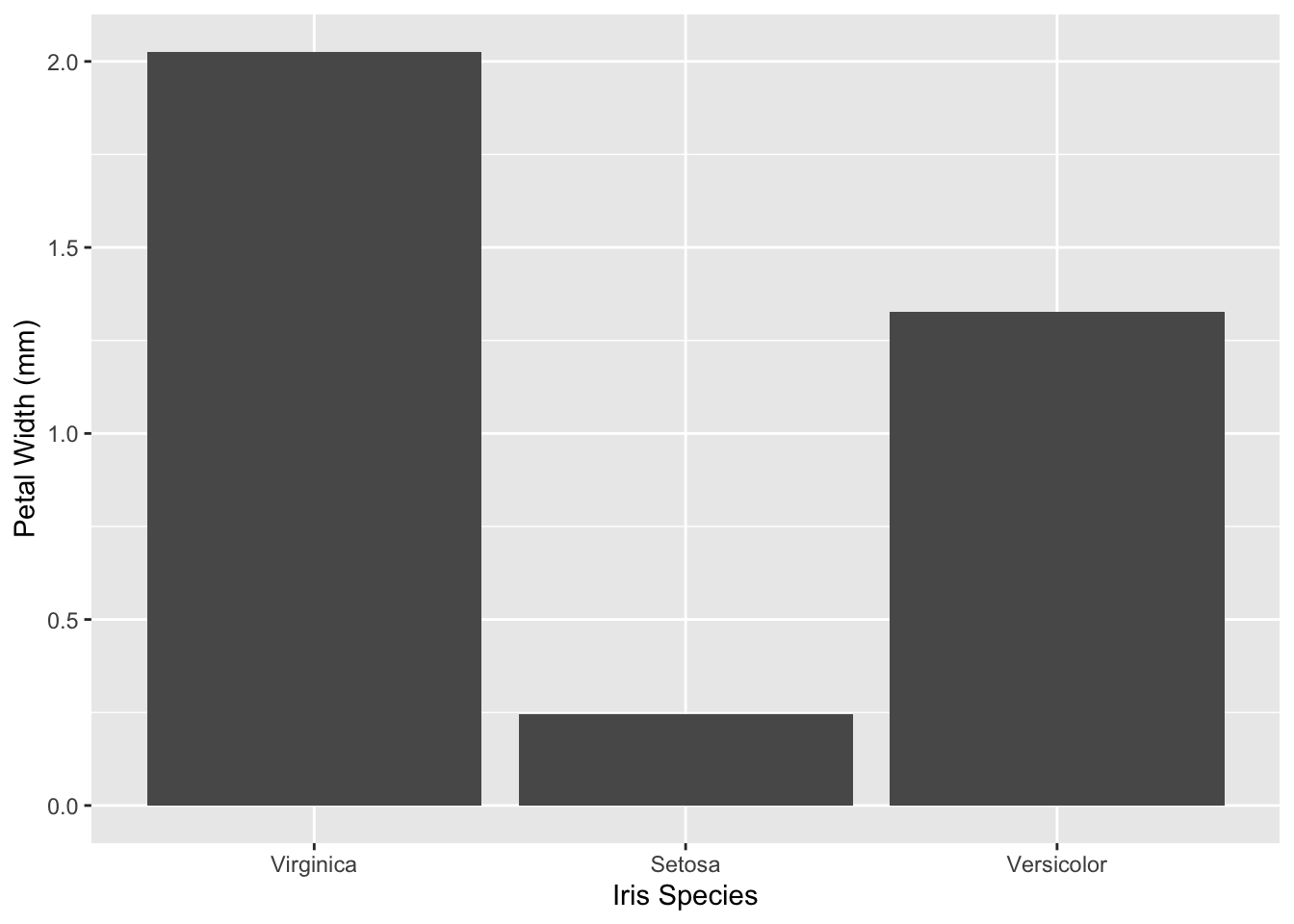
By default, R will sort discrete groups alphabetically. If you want to change that, we can use the limits parameter of the scale_x_discrete() function:
ggplot(data = iris, mapping = aes(x = Species, y = Petal.Width)) +
  geom_bar(stat = "summary", fun = "mean") +
  labs(x = "Iris Species", y = "Petal Width (mm)") +
  scale_x_discrete(limits = c("virginica", "setosa", "versicolor"),
                   labels = c("Virginica", "Setosa", "Versicolor"))
Make sure you re-order your labels when you re-order your discrete limits! Otherwise, you can end up with a group called Virginica which is actually Setosa.
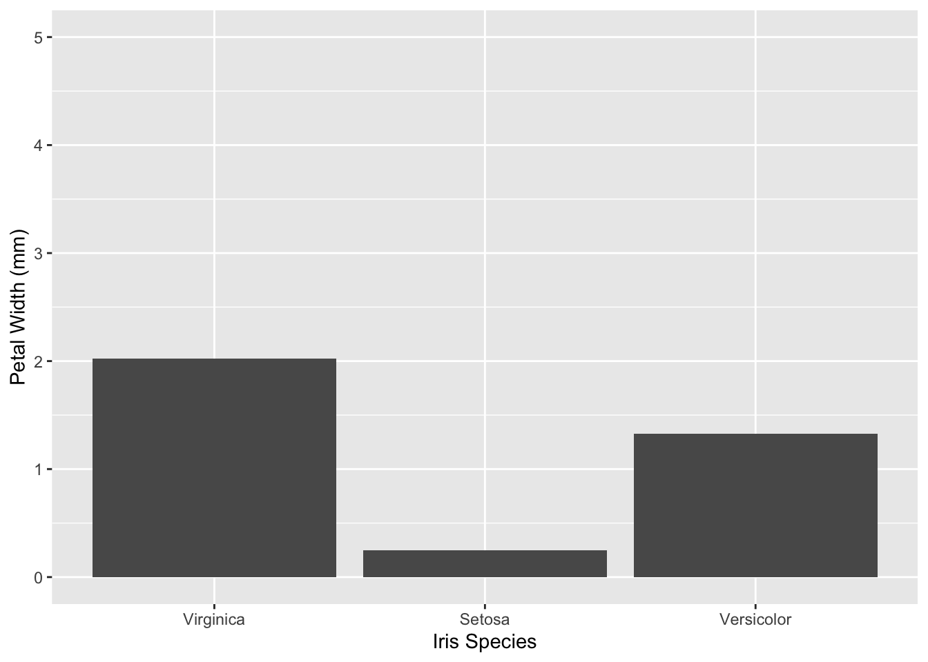
An axis is considered continuous when it is composed of a range of numbers where a value can exist anywhere within that range. For example, most numeric measurements, such as height or length, would be continuous. This is most commonly the y axis, like in our iris plot. While R is good at guessing the range that best fits, sometimes you may want to edit the lower and upper limits. A good example of when you would want to do this is if you want two different graphs to be comparable.
ggplot(data = iris, mapping = aes(x = Species, y = Petal.Width)) +
  geom_bar(stat = "summary", fun = "mean") +
  labs(x = "Iris Species", y = "Petal Width (mm)") +
  scale_x_discrete(limits = c("virginica", "setosa", "versicolor"),
                   labels = c("Virginica", "Setosa", "Versicolor")) +
  scale_y_continuous(limits = c(0, 5))